
19 Professional And Useful Lightbox For Mobile Showcase
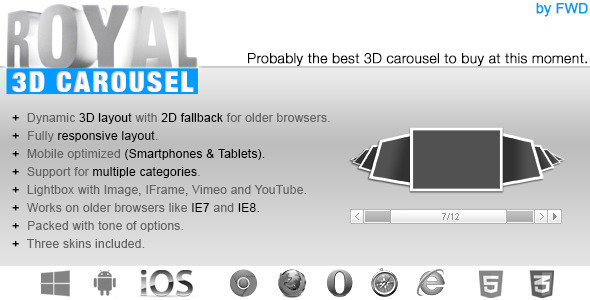
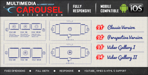
It’s perfect for presentations, for anyone who wants to obtain a great impact on their visitors. Fully Responsive & Mobile Optimized (Smartphones & Tablets). Support for old browsers like IE7 and IE8, on older browser that don’t support CSS3 the carousel will be displayed in 2D mode. Support for images and HTML content. Support for multiple categories and each category can have it’s own set of thumbnails. Original media lightbox that we have coded, with image, vimeo, youtube or iframe support. The lightbox can be used when a thumbnail is clicked to display media content.
ZoomBox Lightbox Intro – top
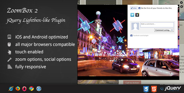
ZoomBox 2 – The Photographer’s Lightbox ! What makes ZoomBox unique to the other lightbox scripts ? In short – quality, user-friendliness, design and wordpress gallery plugin connectivity.ZoomBox Lightbox Features
fully responsive – looks great from mobile to HD
Retina-ready - graphics have double resolution for smooth retina viewing
iPhone / iPad optimized – this gallery has been optimized for Apple touch devices
For non-SASS users it’s no problem either because CSS files ( generated by SASS ) are provided
the only lightbox script that does deeplinking right – most lightbox scripts use hashes for delivering the deeplink, but the problem with that is that facebook likes for example will not get counted for the photo the user is viewing in the ZoomBox, but for the entire page instead. This is awesome if you want to have a contest for example and the photo with the highest likes wins.unique ability to zoom on photos – this is the perfect lightbox script for photographers to showcase their work because on any image, your visitor can zoom it and see the marvelous details you capture in your art.ZoomBox Lightbox Updates
[add] arrows for gallery mode
Yes, it’s optimized for any device
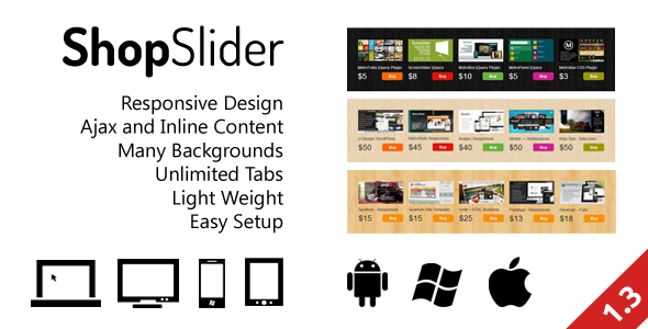
ShopSlider is a lightbox jQuery responsive Shop Slider Plugin for commercial sites, online shops, stores.Demo for AJAX load with Auto Play is disabled
Check Demo on Mobile Devices:
TileBox – Modern Responsive LightBox CSS
MetroBox – Responsive LightBox
MetroPanel – A New Navigator for Modern Sites
The rendering speed and performance is impeccable on desktop computers and most importantly on mobile devices, the way it works it will try to use CSS3 and if this is not available it will down fall to CSS2 or CSS1 for older browsers like IE7 and IE8. Great performance on mobile devices, you can see in the video demo that it runs just like a native app!, it was coded and optimized for mobile devices and it is 100% mobile compatible and of course it will run just as great on desktop computers including on older browsers like IE7 and IE8. Flexible / Fluid layout: you can control the size of the grid with CSS or JavaScript, basically it has an adaptable layout which makes it the perfect candidate for any type of project. For example if you have a total of 120 thumbnails you can show them in sets of 50 thumbnails, and so initially in the grid the first set of 50 thumbnails are loaded and displayed, and when the “load more thumbnails” button is pressed the next set of 50 thumbnails are loaded and displayed, and finally when the “load more thumbnails” button is pressed again the 20 remaining thumbnails are showed. Custom press thumbnail action: when a thumbnail is pressed you can choose either to display an original media lightbox which we have coded, or to open a new webpage, the url and target of this webpage can be specified. The lightbox can display images, or can display videos loaded from YouTube or Vimeo. LIGHTBOX MAIN FEATURES
Zoom and panning support for images: you can zoom in and out an image and you can pan the image, in this way you can see the image in great detail (optional). Keyboard support: the left and right arrows can be used for navigation (optional).2013 – Fixed some bugs related to the lightbox and added better support for mobile detection.
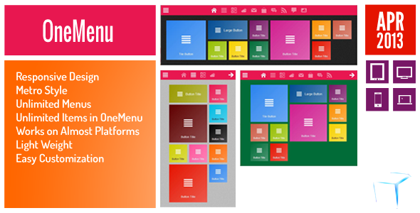
OneMenu is a menu navigation plugin that is created for Metro UI themes.Responsive Design for Metro Themes
Mobile Demo
TileBox – Modern Responsive LightBox CSS
MetroBox – Responsive LightBox
MetroPanel – A New Navigator for Modern Sites
optimized for mobile – look and feel of a native app on mobile with touch swipe, pinch zoom etc
lightbox or full page
show all pages – vertical or jQuery slideshow with horizontal thumbnails depending on the layout, with scrollbar, optimized for mobile devices
advanced zooming support with mouse wheel zoom on desktop, pinch zoom on mobile, scrollbars when zoomed, touch swipe, click and drag
retina friendly icons – icon font used for menu icons, fully customizable – change color, size, add drop shadow ect.fix for 2d flip animation for Opera and IE
bug fixes for IE 10
added lightbox mode – book can be opened in a lightbox when clicked on a book cover
added light effect for 3d flip
Performance optimization for 3d flip on android
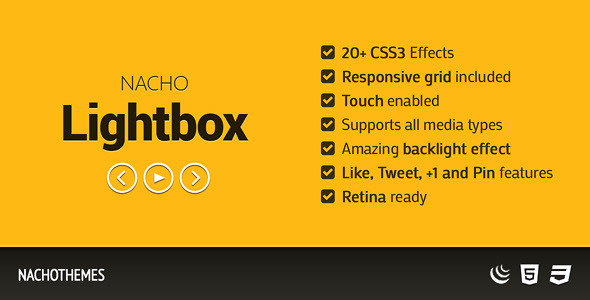
NACHO Lightbox is the perfect plugin for showcasing images, videos, iframes and even ajax in a modern and usable manner that is available on every device.Flat skin – perfect for modern websites
Responsive and beyond – very adaptable, perfect for desktop, tablet and even mobile. it takes advantage of the GPU on mobile devices.Designed for touch
Support for multiple categories, of course it can still be used with a single category as before.Lightbox Iframe support.Lightbox description autoopen (open item description without pressing the info button).Added an extra way to close the lightbox by pressing outside the item area.Added support for MSPointer events for windows8 mobile. When a thumbnail is pressed you can choose either to display an original media lightbox which we have coded, or to open a new webpage, the url and target of this webpage can be specified. The lightbox can display images, or can display videos loaded from YouTube or Vimeo. The rendering speed and performance is impeccable on desktop computers and most importantly on mobile devices, the way it works it will try to use CSS3 and if this is not available it will down fall to CSS2 or CSS1 for older browsers like IE7 and IE8. Great performance on mobile devices, you can see in the video demo that it runs just like a native app!, it was coded and optimized for mobile devices and it is 100% mobile compatible and of course it will run just as great on desktop computers including on older browsers like IE7 and IE8. Responsive / Flexible / Fluid layout: you can control the size of the grid with CSS or JavaScript, basically it has an adaptable layout which makes it the perfect candidate for any type of project. Support for any number of images and each image can be of any size, but proportional to a base thumb width and height
For example if you have a total of 120 thumbnails you can show them in sets of 50 thumbnails, and so initially in the grid the first set of 50 thumbnails are loaded and displayed, and when the “load more thumbnails” button is pressed the next set of 50 thumbnails are loaded and displayed, and finally when the “load more thumbnails” button is pressed again the 20 remaining thumbnails are showed. Custom press thumbnail action: when a thumbnail is pressed you can choose either to display an original media lightbox which we have coded, or to open a new webpage, the url and target of this webpage can be specified. The lightbox can display images, or can display videos loaded from YouTube or Vimeo.Lightbox main features:
Zoom and panning support for images: you can zoom in and out an image and you can pan the image, in this way you can see the image in great detail (optional). Keyboard support: the left and right arrows can be used for navigation (optional).2013 – Bug fix related to the lightbox when it is zoomed on Chrome and better detection for mobile devices.
Customize Cell Sizes for Many Screen Width
Mobile Demo
TileBox – Modern Responsive LightBox CSS
MetroBox – Responsive LightBox
MetroPanel – A New Navigator for Modern Sites
Try our examples and also resize the screen for a responsive preview. Or check it out with your tablet (of course it works on every modern browser (including IE8) and on iOS(iPad,iPhone) and Android mobile devices)!
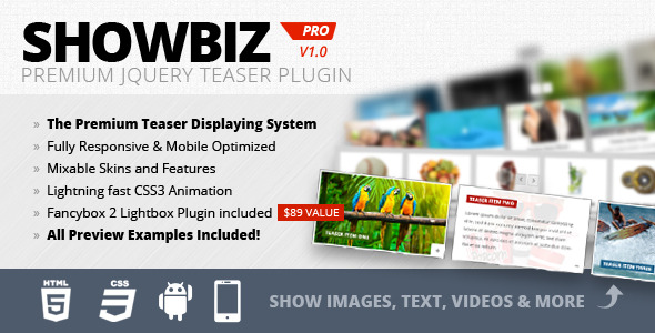
Fully Responsive & Mobile Optimized (Smartphones & Tablets)
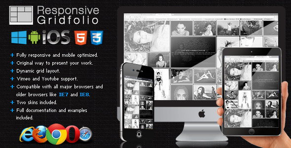
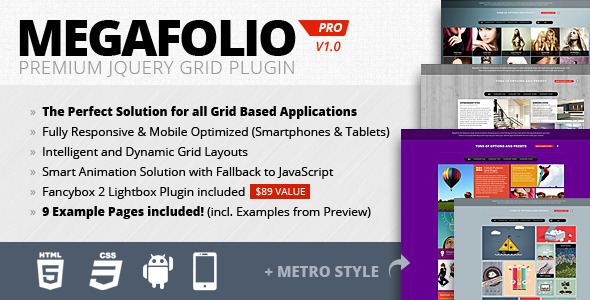
The Perfect Solution for all Grid Based Applications
Fancybox 2 Lightbox Plugin on Multi Domain License included ($89 Value)
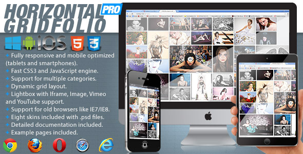
It’s perfect for presentations, for anyone that want to obtain a great impact on their visitors. When a thumbnail is pressed you can choose either to display an original media lightbox which we have coded, no action or open a webpage. The lightbox can display images, iframe (html pages) and videos loaded from YouTube or Vimeo. Horizontal Gridfolio Pro is mobile optimized running great on iOS (iPad, iPhone), Android and Windows8 mobile devices and of course it works on every modern browser and older browsers like IE7 and IE8. Support for any number of categories and each category can have any number of images, if it has only one category the categories selector is disabled/not visible. For example if you have a total of 120 thumbnails you can show them in sets of 50 thumbnails, and so initially in the grid the first set of 50 thumbnails are loaded and displayed, and when the “More thumbs” button is pressed the next set of 50 thumbnails are loaded and displayed, and finally when the “More thumbs” button is pressed again the 20 remaining thumbnails are showed. Custom press thumbnail action: when a thumbnail is pressed you can choose either to display an original media lightbox which we have coded, or to open a new webpage, the url and target of this webpage can be specified. The lightbox can display images, iframe (html pages) or videos loaded from YouTube or Vimeo.Lightbox main features.Video autoplay: When a video is displayed it can be set to autoplay (this feature is not work on mobile because the operating system is not allowing it).Iframe support: The lightbox can display HTML pages, all you have to do is to include the link of your page that you want to display.Image support: The lightbox can load and display .Zoom and panning support for images: The images can be zoomed in and out or paned, this way you can see the image in great detail (optional). Keyboard support: The left and right arrows can be used for navigation (optional).
Please check out the examples to see for example how a small preview view expands to a rich detailed panoramic view. Try our examples, check the sourcecode toggle and also resize the screen for a responsive preview. Or check it out with your tablet (of course it works on every modern browser (including IE8) and on iOS(iPad,iPhone) and download slideshow jQuery devices)!
Fully Responsive & Mobile Optimized (Smartphones & Tablets)
Fancybox 2 Lightbox Plugin on Multi Domain License included ($89 Value)
Set Amount of Entries in 4 Level for Responsive Look
added new features and skin for Commerce Usage.
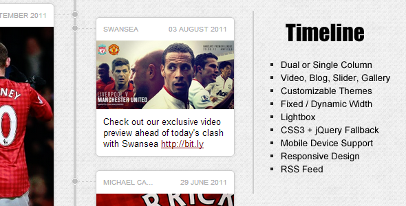
A full CSS3 lightbox is also included with the option to be turned on/off.Allows to you embed multiple images into one element with left and right arrows for navigation. Images rotate automatically and could have lightbox enabled or disabled.Allows you to create a blog post style element with a lightbox enabled image on the top, and a read more link at the bottom.Timeline also comes with “must have” responsive design which lets it to be displayed on mobile devices like a champion.Each timeline element can have its own width set or use the default which allows you to have a more creative/unique design for you own timeline.Lightbox
A full CSS3 (jQuery Fallback for IEs) lightbox is included which can be applied to images used in elemetns.Full API functions for advanced use
CSS3 animations + jQuery Fallback for IE
All animations are written in CSS3 for better performance, and old IEs will get jQuery animations.Timeline has been thoroughly tested in all major browsers and mobile devices, performance is also optimized for each browser.D Do DD M Mo MM MMM MMMM YYYY YYMobile Device Support (see Mobile Demo)
A full example of mobile mode is included in the files, so if you are to build a mobile website, this is what you need. Scan this to view the Mobile Demo
Added responsive and mobile mode to examples
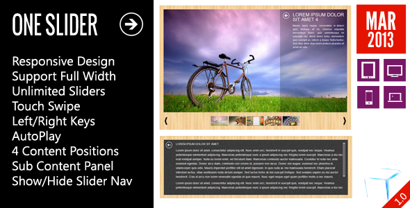
OneSlider is a Responsive Slider jQuery plugin that is not only used to show your banners or JavaScript lightbox image gallery but also allow to add content for each slide.Touch Swipe for Mobile Devices.AutoPlay with Delay Time for Each Slide.4 Positions for Short Content.One Sub Content for Each Slide.TileBox – Modern Responsive LightBox CSS
MetroBox – Responsive LightBox
MetroPanel – A New Navigator for Modern Sites
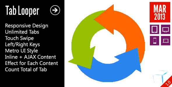
TabLooper is a responsive slideshow jQuery jQuery Plugin that is used to create tabs for your sites with responsive layout, support unlimited tabs, combine inline and slider with ajax content for best performance, move tab content by jQuery touch gallery event ( on mobile devices ) or left/right keys ( on desktop/laptop ) or simple click on buttons ( all devices ).Effects for Each Tab Content.Support Touch Swipe to move Tab Content ( Mobile Devices ).TileBox – Modern Responsive LightBox CSS
MetroBox – Responsive LightBox
MetroPanel – A New Navigator for Modern Sites
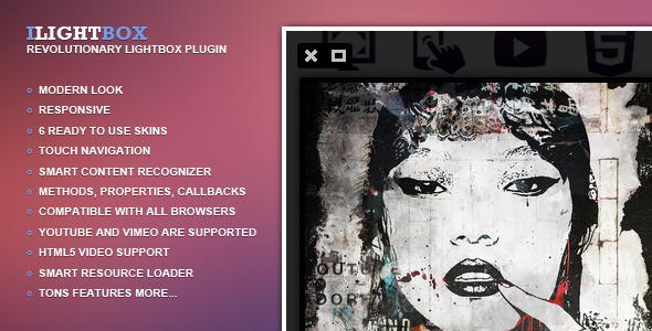
By combining support for a wide range of media with gorgeous skins and a user-friendly API, iLightBox aims to push the Lightbox concept as far as possible.“Greetings, this is amazing lightbox! Nice Job! Modern, lightweight and just awesome. Thanks for the great job.View on your mobile device
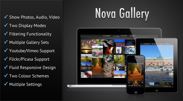
The gallery features a fluid responsive design and can fit in any screen size ranging from t mobile phones to desktop browsers. The gallery also features touch-screen support and uses hardware accelerated CSS based animations wherever possible which results in smooth animations, that is especially noticeable in mobile devices. Also check out the demos in your mobile devices such as iPad/iPhone or Android devices. Plays audio and video natively in modern HTML5 browsers and switches over to Flash/Silverlight for older browsers by using Mediaelement. The gallery features a fluid responsive design to account for various screens sizes ranging from CSS3 navigation bar to desktop browsers and can also be placed in a container of any width. The gallery is mobile device friendly with touch screen support. Hardware accelerated CSS animations have been used wherever possible resulting in smooth animations, which is most noticeable in mobile devices. Handy keyboard shortcuts have been provided for easier navigation of the gallery. You can pull photos from Flickr by searching for a text string or tags. You can pull photos from Picasa by searching for a text string. You can even set for how long the data will be cached. Can mention a youtube custom thumbnail image for the gallery sets. By default the thumbnail for the first item in the set is used to represent the set. Autoplay audio and video when Lightbox opens in Thumbnail Grid mode. Choose the animated effect for the items in Thumbnail Grid mode when it first shows. Choose the animated effect for showing item captions/descriptions in Thumbnail Grid mode. Choose the animated effect for transition between items in Full-width mode. Choose the animated effect for showing/hiding the Gallery Sets screen (home screen). The gallery supports preloading of images in Full-width mode for smoother viewing. The time interval for which a particular item is visible during slideshow can be set. Option to set the path for the gallery configuration XML file. Option to detect mobile devices and serve them a separate XML file.Suitable jQuery based fallbacks have been provided for all CSS based animated effects for older browsers. Modified the code to account for escaping of characters in the cached xml file (when pulling images from Flickr/Picasa) if magic quotes in the server were turned on.Fixed problem with positioning of the gallery overlay/lightbox when there were other content in the page along with the gallery.
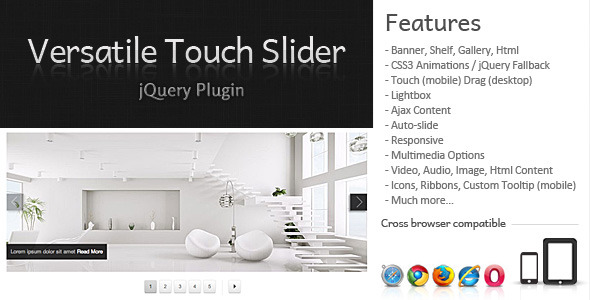
Has the touch feature to mobile and drag for the desktop. Through the lightbox it is possible show multimedia content (video, audio, image and html content). Touch (mobile) and Drag (desktop);
Lightbox (Video, Audio, Image, Html Content);
Icons, Ribbons, Custom Tooltip (mobile);
code changes for compatibility with jQuery 1.